
|
This will be a short one. I’m really just here to praise the graphical Swiss army knife that is Blender. So, a little bit ago, I was working on some textures. The task was to pack a non-alpha grayscale image into the alpha channel. Non-alpha, in that it wouldn’t be used as transparency data for the image. I figured that a channel was a channel so how hard could it be. I’ll back up slightly. Sometimes, when working with textures, especially for realtime 3d applications like games, you want to pack as much information as you can into each texture. Standard image files are made up of three or four channels. The Red, Green, Blue, and sometimes Alpha channels. Usually, each channel is a grayscale image that represents steps from black to white, the contribution of each channel's pixels to the final image. If one pixel of the green channel is one hundred percent white, then the green contribution to that pixel will be turned up as high as it can be. Now there are a lot of perceptual issues that mean that some images have higher contributions from some channels, or they apply different falloff curves to different parts of the color spectrum, for simplicity’s sake, let's just say that each channel has a full range of 128 or 256 steps between black and white for each pixel. There is nothing saying that you need to use those grayscale channels to build up parts of the same image. What if you have three, entirely different, grayscale images. Rather than using up all three channels of one texture, why not pack all of those into a single texture file using the R, G, and B channels. If you have a fourth one, you can pack that into the alpha channel. At least that’s what I thought. Channel packing using the R, G, and B channels is pretty trivial, and pretty much any image editor will let you do that. Packing stuff into the Alpha channel proved to be a bit more difficult. The Alpha channel is usually used for transparency. Same rules apply, though. It is a grayscale image that controls how transparent or opaque each pixel is. The problems happen when you make a pixel 100% transparent. Most image editors are pretty smart. They will try to infer what you are trying to do. If you convert an image from say, RGB color format to CMYK for printers, there is a set of steps and conversions that the image editor will go through to try to keep the colors as accurate to what you intended as possible. The same thing happens when you set a pixel in the alpha channel all the way to transparent. Most image editors will set that same pixel in the R, G, and B channels to zero as well. It makes sense when you think about it. If you are saving that image out with a bunch of zeros, data compression schemes can shrink the file quite a bit. Only problem is, when you are trying to do channel packing, you don’t want to lose that information. Now, not all image editors did this. Some kept all the info, but had other issues. They couldn’t read the input images properly, or they couldn’t create an output image properly. They didn’t work with the formats I needed, or they lacked support for linear color space (sort of a must for some texture work). After trying all the standard image editing tools I have, and it’s not an exaggeration to say that I have an awful lot, I found that only Blender did everything that I needed. Not only that, but it did it better and easier than any of the others. I will qualify that ‘easier’. Blender can look like the control panel of a 747 and it has functions buried under its function, but if you happen to know how it works, you can mix and match and mess with images in a truly unrestrained way. I used the compositing part of Blender. It’s intended to be used to layer rendered or filmed images, blending them and adjusting them until they look seamless. It’s the sort of software used to piece together visual effects sequences in movies. Because of that raw image manipulating power, it’s also uniquely suited to ripping apart and reassembling textures in the most amazing ways. I created a pipeline that split all of the channels and then recombined them in any way that I liked, and any set of images that I used as the input could be run through the system and recombined. Not only that, but Blender works with damn near any image format that you could imagine, and it’s all hardware accelerated. I could rip apart massive 5K textures and put them back together into uncompromising .EXR files (without a doubt, the best image format that people have come up with), in literal seconds. I don’t know that a tutorial on how to do it is exactly warranted here, but this is a picture of the node tree that the textures run through. Blender is really one of the best things to happen to graphics in a very long time. 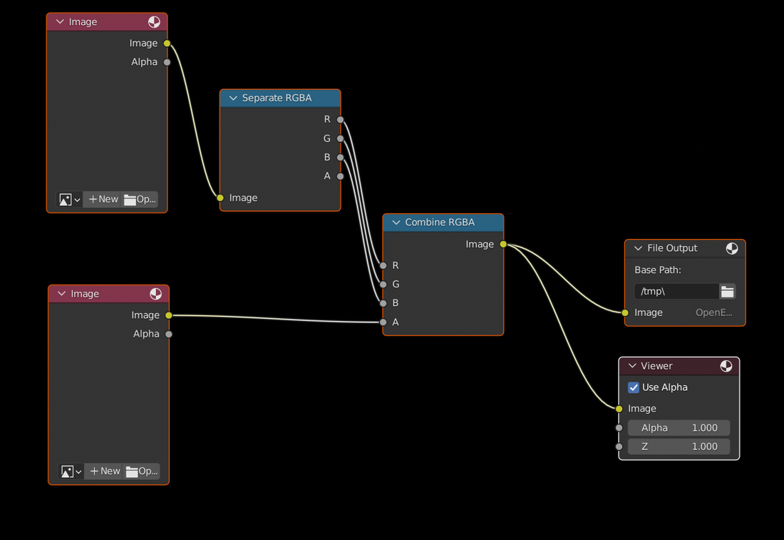
0 Comments
I want to talk about sci fi doors. Okay, this is important. Actually, you’re right. It is super not important. It’s silly. But I just want you all to know that I have a real problem with sci-fi doors. Before I get too far ahead of myself and start ripping on some artist's work, I know, I get it. I’m an artist too, and I have made a lot of sci-fi nonsense. Greebles and patterns that really don’t mean anything on machines of indeterminate function. I do it a lot. And I will do it again. I get it. I understand. Designing something that looks futuristic and interesting is tough. There are only so many techy looking crates and boxes a person can think up before things start getting weird. I do have a real problem with doors. Sci-fi doors. Some of ya’ll got to get it under control when you are thinking up doors. Every single one of you has used a door. There is just no way that you are this far into an art career that you have been given the opportunity to draw, paint, model, or construct sci-fi decor and you don’t know that form and function of a door. It’s just not possible. You have used a door. I went and typed ‘sci-fi door’ into google image search. Go ahead, try it now. Type that in. An awful lot of them look similar, don’t they. You know what they don’t look like. Doors. Doors might be one of the most practical and least artistically adorned bits of architectural technology that we have come up with. They are never overly fancy, pokey, or embellished, because people will be interacting with a door on a near daily basis. They are usually pretty smooth. They have one extremely obvious interaction point. If they have hinges and rotate on those hinges, they have to be fairly light or at least well balanced. You know what I didn’t see in several pages of the google image search? A door on hinges. You know what most doors in the world have? Hinges. Even most doors in space and at sea have hinges. Because hinges are practical and reliable and if the door breaks, those hinges are easily accessible and repairable. You can make a solid airlock or water seal with a hinged door. Doors on hinges are good and useful, so I doubt that we will abandon them in the future. Look at this regular ass door. 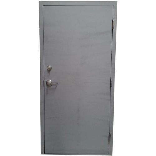 Not only is this door easy to understand, but depending on the frame it could also be watertight or even airtight. It could be fire poof, bulletproof, even blast resistant. This door probably has most of your door needs covered for centuries. Okay, so let's just say that we have figured out a really amazing and robust sliding door mechanism in the future. They are more reliable than elevator doors and we can install them everywhere. Fine. Maybe prefabricated doors that slide into a bulkhead or some other sci-fi structure can be made cheap and common. Totally fair. Have a look at this thing. 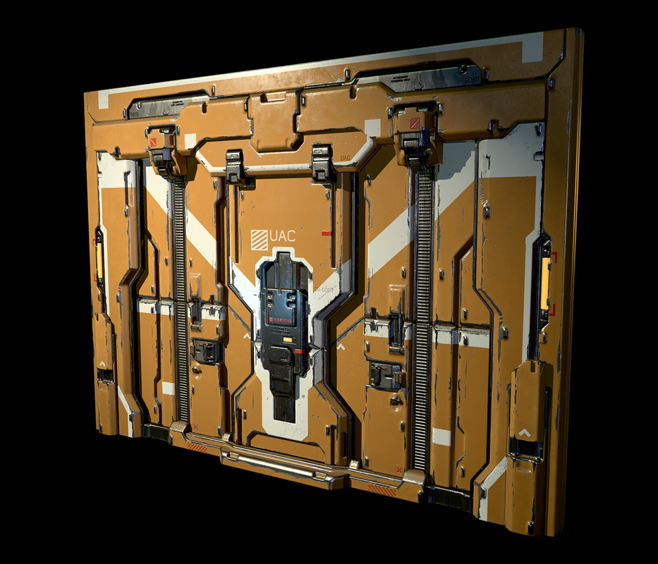 Again, I don’t want to drag this artist. The modelling work on display here is pretty good. The material work is nice, and the color scheme is pleasant enough. But what the absolute fuck is going on here. How do I open this? Why are there so many angles and shapes? Why do the white paint lines cross multiple panels? Is it supposed to blend into the rest of the wall? Why are there so many bits you could catch your sleeve or finger on? This door looks like it’s always a little bit greasy. Or it might give you tetanus. Whatever it is, this doesn’t look like a practical door. That door isn’t an outlier either. I didn’t pick it just to make a point. It was literally in the top row of images when I typed sci-fi door. So was this. 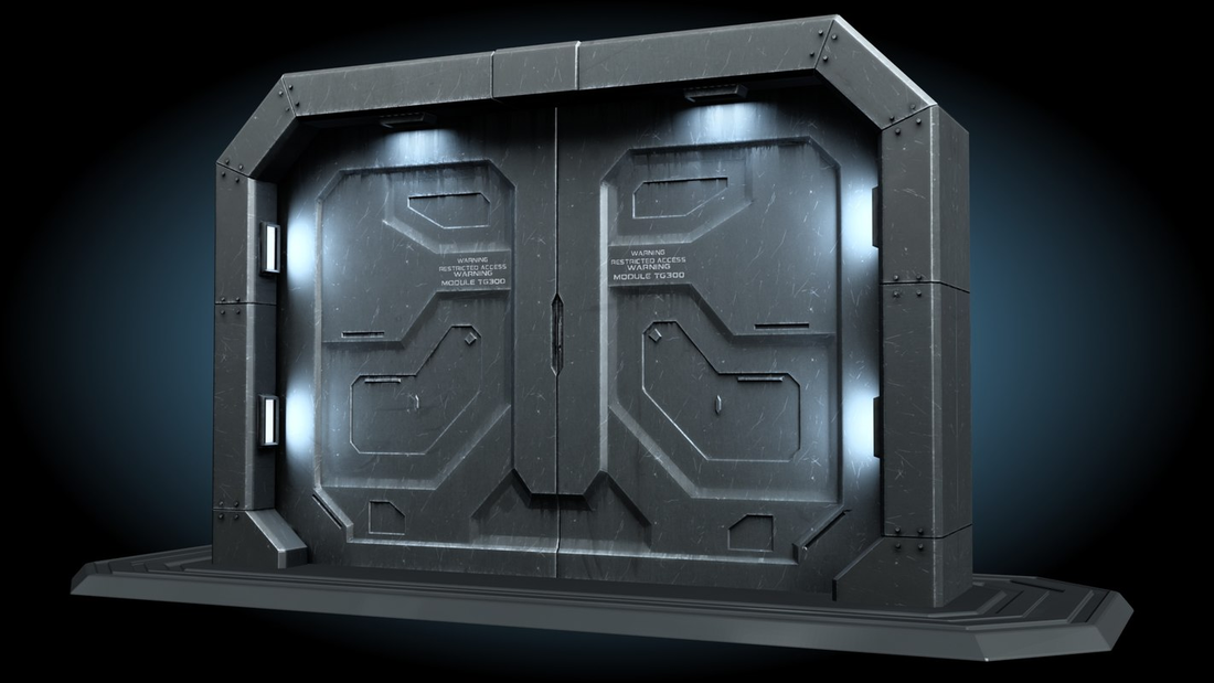 Why is the edge lit up? Wouldn’t it make more sense to light up the latch or handle? Which brings us to, where is the latch or handle? Who knows. Maybe it’s an automatic door. If that’s the case, what are all those indents and shapes for? Does it have really high cat flaps? Are there multiple peep holes? Do you have to be close enough to read the text before the automatic door sensor goes off? I don’t know about you, but 99% of the automatic doors I come across are pretty smooth. Because there is no need for all that other crap. Smooth is all it needs to be to do its job as a door. If you thought those were odd, have a look at this. 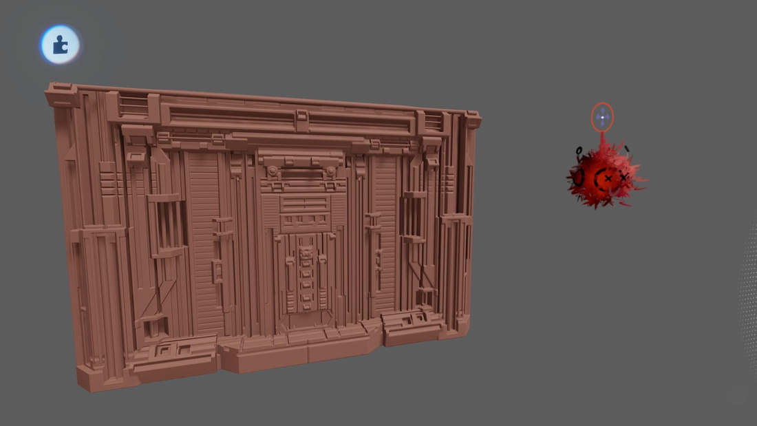 This door looks like it intends to open me up. I can’t even guess how this thing slides or pivots. Maybe it’s like a transformer and it unfolds into an entranceway. I feel like someone said sci-fi door and this just manifested. Like calling for the Candyman. Again, and I can’t say this enough, I am not ripping on the art. Making any of these doors is tough. It takes work. What I am questioning is when did we decide this was what a sci-fi door looks like. What in the past several centuries makes us think that we will deviate so wildly from current trend of door technology. Doors are one of the few things we as a species have really nailed. Our doors work very well. It’s not all terrible.Have a look at this 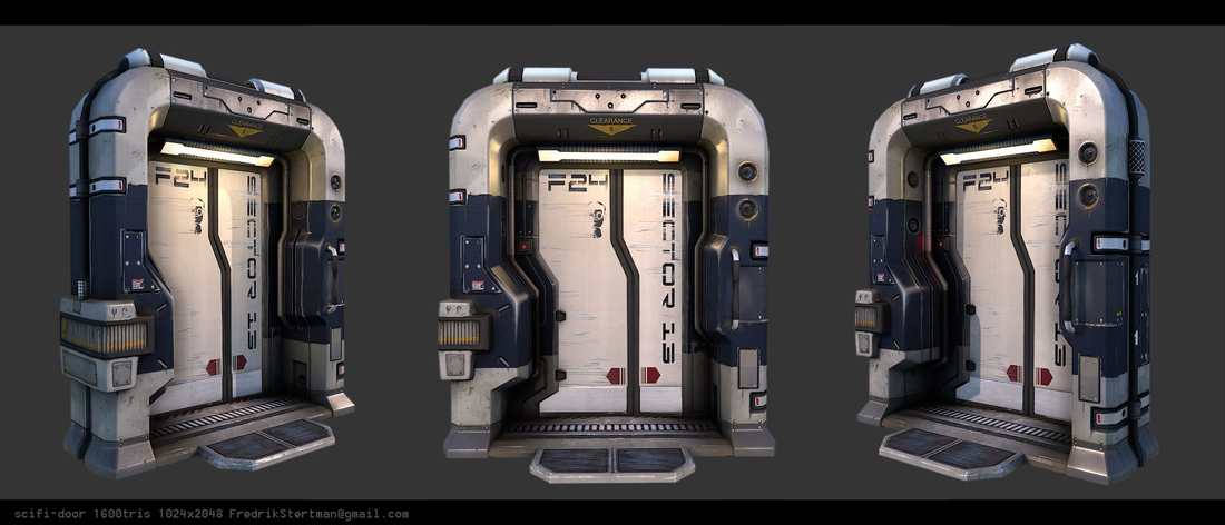 Other than have a jog in the split of the door for some reason, it’s not bad. There is a clear touch pad or entry system off to the right. There is a door mat for you to wipe your feet on. The light is aimed at the entrance so you can both see the door and, presumably, the occupants can see on video who is at the door. Surface adornment is kept to a minimum. Access panels might hide the workings of the door for maintenance or upgrade. All in all, a well considered door. Even if it is of the slidey variety. Have a look at this one. 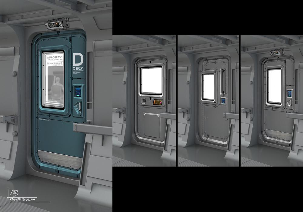 That looks like a regular old, hinge door. Pretty basic. Functional. Recognizable. There is no doubt, it’s a door.
So, here is my plea. If you find yourself designing some sci-fi thing in the future, don’t overdo it. If the thing is a kettle, it’s okay if it just looks like a kettle. Doors can look like doors. Shoes can look like shoes. These are things that won’t change a lot as we venture out into the stars or to the depths of the ocean or across dimensions or whatever. A door can look like a door, and that is good enough. Best Games - Karate Champ
Now hear me out. What if a game could be one of the best games ever made while being completely broken in very fundamental ways? What if a game could have innovative, even revolutionary, controls while being terrible to play? What if a game could represent a tectonic shift in what multiplayer games could be, while mostly coming down to random chance? Without Karate Champ, we don’t get a Street Fighter or a Street Fighter 2. Without Karate Champ, there is no Mortal Kombat. Karate Champ represents a fundamental shift in how arcade games could, and would, be made. If Karate Champ didn’t exist, we would have to invent it. Karate Champ (or Karate Do in Japan) is a one on one fighting game released in 1984, well before fighting games were a genre. It is a game that aims to be as much a simulation of a sport as it does a martial arts fantasy. In the single player mode, the player alternates between rounds of one on one fighting with computer opponents, and challenge stages where you have to break pots or bricks or fight a charging bull. It’s weird, but it all works as a piece. All at once, regional Karate tournament and martial arts action movie. In the versus mode, you use all of those same Karate skills against a real live human on the same cabinet. It can make for very fast, fun, and dynamic matches. The innovation in Karate Champ is, without a doubt, the control system. Most arcade games in 1984 used one joystick and one or two buttons. Any layout that varied from that template usually meant you were in for a wildly different game. A couple years earlier, Robotron: 2084 operated with two joysticks. That game was a fairly standard move and shoot type game, but the two joystick control scheme allowed players to move in one direction while shooting in another. It was the game that created the twin stick shooter genre. Karate Champ used that same control system, but combined the stick movements together in a sort of macro. The left stick was primarily used for moving your Karate combatant around, but when you chained movements on the left stick with directions on the right, you could pull off all sorts of authentic looking Karate moves. It introduces pull back to block. It includes high, middle, and low attacks. If you pull down on the right stick and up on the left, you can do a forward flip that can put you on the other side of your opponent. There are moves that attack behind you. There are jumping kicks. Link all of this with the ability to fight a real human opponent and, make no mistake, Karate Champ is a fighting game. Karate Champ, out of the gate, incorporates so much of what would become the core of modern fighting games. It was an arcade hit, but it could have been massive. A cultural totem. It comes up short in one area, otherwise we would probably be playing Karate Champ 8 at EVO now. It’s the one thing that fighting games wouldn’t get right until Street Fighter 2. It’s really hard to hit anything. The collision system for Karate Champ is odd. Often, your fist or foot will pass harmlessly through your opponent. Then, every once in a while, a strike that seemed to end a few pixels before them will land. In a game where it only takes two solid hits to win, it feels far too random. The hits, when they land, are solid and satisfying, but it could be anyone’s guess whether they will land at all. Street Fighter 2 is far from any sort of simulation of fighting. There are a lot of strange impact shenanigans that happen every match. It is also extremely rare that a punch that looks like it hit, will whiff. You can always be reasonably sure that your range is right for a particular attack. It feels like what you try to do, you can do. Karate Champ is just too much of a constant dice roll. The same kick at the same range may or may not hit depending on the frame of animation your opponent is currently in. If you played some chess, but on every turn three of your pieces went into a quantum superposition between two other pieces, it would become impossible to play. You wouldn’t know, until you made your move, if a piece was a pawn or a rook. If you lost, it wouldn’t feel fair. If you won, you would have no idea how to repeat it. That’s what playing a lot of Karate Champ feels like. A constant game of guessing if the thing you are doing with your hands will have the desired effect on screen. I’m certain that there are people out there who have become deft at playing Karate Champ. Not nearly so many as there are for Street Fighter 2. It’s a matter of expectation and consistency. If you swirl the controls in a certain way in Street Fighter 2, you can be pretty sure what will happen. Not so for Karate Champ. This is another one of those almost games. Arcade experiences that point the way to huge things in the future. I think it’s fair to say though, without Karate Champ, we may never have developers explore the one on one fighting space. It does so much right, and it is still fun to play. It came up inches short of being revolutionary. Maybe it’s only for historical reasons, but Karate Champ is one of the best games. We just got back from a trip to Disneyland. We’ve been a couple times, and I always wonder at their ability to design spaces. If you have done any game development, or even if you’ve just played a lot of games, you will know that most of game design is moving people from one place to another, one task to another. Doing that smoothly, interactively, and enjoyably, is arguably the core of game design. If a menu is difficult to use, if an interface is tricky to manage, people won’t play your game. If there are too many unintuitive moments or situations, people will quit playing. Difficult puzzles and complex interaction take a distant backseat to the more common knob twiddling and button pressing that players are required to do. It’s these spaces between the ‘gameplay’ where most players fall off. The people who design Disney’s parks are absolute masters at this. If the rides and shows are the ‘gameplay’ getting people from one to the other is the game design of a theme park.
I have written a little about how they use eyelines and the transitions between spaces to guide your experience. That’s probably what most people will notice and comment on. The physical movement from place to place. You usually won’t be able to see one area or land from another. Structures will block your view until you get pretty close to another area, and even then the transitions can take you by surprise. This makes you feel more immersed in the land you are in, but it also makes you feel like you are discovering things just by walking. You turn a corner, or pass under an archway, and suddenly you are in a whole new place. This manipulation and crafting of physical space is amazing, and it’s worth studying if you are at all interested in how game levels work. Especially if that game level has to accommodate hundreds or thousands of players. I want to focus on something else. A little bit of UX that disney has really refined. Information. It would be easy to just provide all information at all times. A lot of seasoned game designers often say that you should provide as much information to the player as you possibly can, and then let them decide what to do with it. Like most things, it’s never that simple, and the user experience can sometimes be improved by withholding some information. I will provide a couple of examples I noticed during this last disney trip. First is the most obvious bit of information. The length of ride lines at Disneyland is posted at the entrance gate to each ride. This is something they have been doing for some time. They break the times up into five minute increments, but if the board says five minutes, that really means you can just walk right on. Anything from fifteen minutes to thirty minutes will probably be shockingly accurate. Now this bit of information can do a few things. First, guests of the park can decide if they want to wait in line or not. Lines to ride popular attractions are a given, so some amount of waiting is expected. As the time to ride increases, the amount of people who are willing to wait decreases. Only the most popular rides will ever have line times longer than an hour. There are so many other attractions at the park, you might as well head off to one of the other ones. Just this little bit of information will naturally spread guests around the park, and get people to try out less popular attractions. That bit of information does something else too. You can see most of the lines snaking out from the rides, but people are extremely bad at estimating. If you looked at the line to, say, The Haunted Mansion, it would be difficult to judge the difference between a half hour long line or a one hour long line. Often, parts of the line are out of view of the path, so you wouldn’t even be able to count the people if you wanted to. Ride operators will adjust the length of the line by opening and closing different loop-backs and u-turns. Visually, the lines can be very deceiving. The shape and space of the lines changes from ride to ride as well. Something that looks like a very long line on one ride might only be a few minutes on another. Those boards will help you decide how to spend your time at the park. Pair that with the phone app that provides you with the same information about ride wait times, and you have the makings of a really powerful queue and crowd management system. All you had to do is provide the information. The next thing is maps. Disneyland has a distinct lack of maps. You know those ubiquitous mall guide boards? Yeah, Disneyland doesn’t have any of those. You can certainly grab a map from the information booth, or you can look at the one in the phone app, but everything in the park is set up so that you don’t need one. If you follow any path, it will loop back around to the main hub. Every path, eventually, feeds back into the central ring of the park. This means, if you know where it is you want to go, you are probably never very far from it. But also, if you don’t know where you want to go, and this is the important bit, you can just keep walking forward to inevitably see all of the park. You could just walk around and experience a constant sense of discovery. There are no maps, and almost no road signs to direct you. They want you to feel like you are exploring and discovering. Because that makes simply walking around fun. There are lots of little alcoves and cul-de-sacs to find. All of them designed specifically for discovery. If there were waypoints and road signs that pointed you directly to Space Mountain, there would be a lot of park goers who would miss other attractions. So, here we have two very different examples of how to use information. Deliberately providing or withholding information can change user experience for the better. Disneyland has had decades to get it right, and for the most part they do. I didn’t even get close to talking about how they pack ride lines into ridiculously small amounts of space, or provide a show experience while you are in line so that wait times don’t feel as long. I think I will go over those at some point, but these two bits of informational experience design should be enough to chew on for now. Blender has a new-ish feature called geometry nodes. I won’t be doing any sort of tutorial or how-to about it here. I have done a few things with it, but I don’t have any level of expertise that I would feel comfortable sharing. At best, I might be able to explain it.
When you are modelling something… let’s use an example. Say you were modelling a drink vending machine. This is a vending machine that needs to be able to work, or at least look like it works. There is one of those little drink elevators and a bunch of slots that hold all of the beverages. This is the sort of thing that you could model traditionally. You could make all the parts. Find out what the average vending machine sizes are and scale a box to that size. Design each of the drink bottles or cans. Create a marquee and set up an array of lights behind it. If you only need one of these drink machines, that’s it, you’re done. What if you need a handful of them? A few different sizes, different marquees, all with different drinks and different lights burnt out behind the marquee. You could set up a few of them. But how many? Six? Twelve? How many different vending machines would it take to ensure that when you spread them out over an entire city, no one would be able to see the repeats? Each machine would seem unique. Geometry nodes is a way of programming your models. You create a set of rules that spit out models, and then you can have it randomize the results. You can either feed the system a selection of prebuilt parts, or you can have it build the entire thing from a single vertex on up to a full object. The system incorporates the material nodes system as well, so you can have the surface color and texture change along with the model. You can have it swap out the type of drinks, what slots are full or empty, how many drinks are in each slot. There really is no end to it. Every time the generator runs it will create a new vending machine based on those rules. Geometry nodes can be more complicated to set up than regular, straight ahead modelling, but the end result can create a dizzying array of assets. It’s not a tool that needs to be deployed in all cases. There are probably a lot of assets that are better built as one off models, but some things, things that are repeatable objects with slight, but important variations, could make excellent use of this tool. Like I said, I’m not going to do any sort of breakdown of it, but I did use geometry nodes to create a system that can make any sort of rail line, or road, or path, or really anything that is roughly a repeated object along a curve. And it works. |
Archives
February 2024
Categories |
 RSS Feed
Owen McManus